ConnectWallet
ConnectWallet component renders a button which when clicked opens a modal to allow users to connect to wallets specified in the ThirdwebProvider's supportedWallets prop.
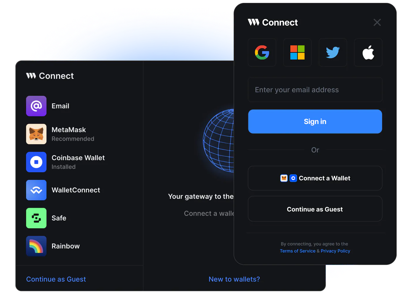
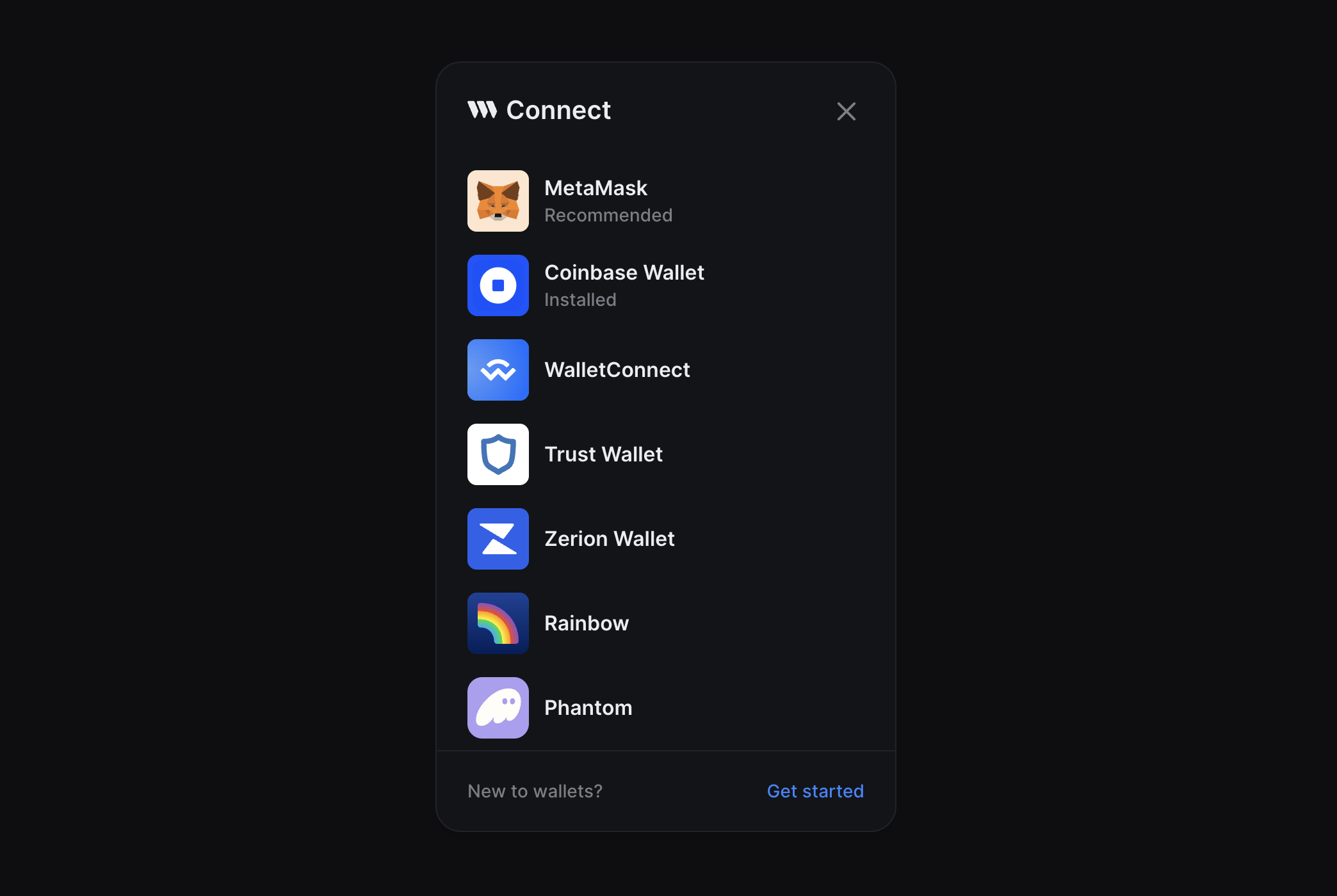
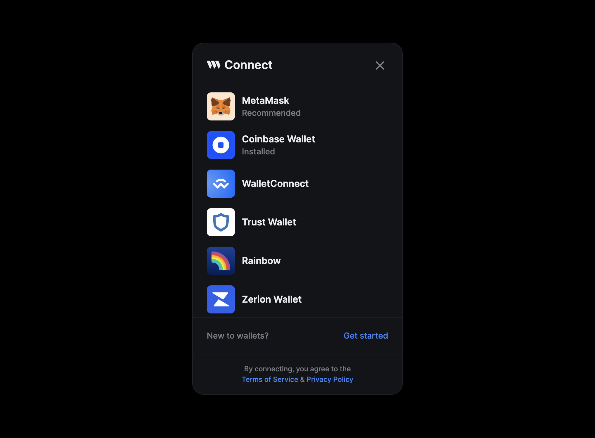
If supportedWallets is not configured in the ThirdwebProvider, the ConnectWallet Modal shows the below shown default wallets:
Usage
import { ConnectWallet } from "@thirdweb-dev/react";

function App() {
  return <ConnectWallet />;
}
Live Demo
Try out ConnectWallet in action on ConnectWallet Playground!
Props
Appearance
modalSize
ConnectWallet component's Modal has two size variants - "wide" and "compact"
The default is "wide" for desktop and "compact" for mobile devices
Note that it is always "compact" on mobile even if you set it as "wide" because of size constraints on mobile devices.
Wide
The wide modal shows a Welcome Screen on the right side of the Modal which is fully customize via the welcomeScreen prop.
<ConnecWallet modalSize="wide" />
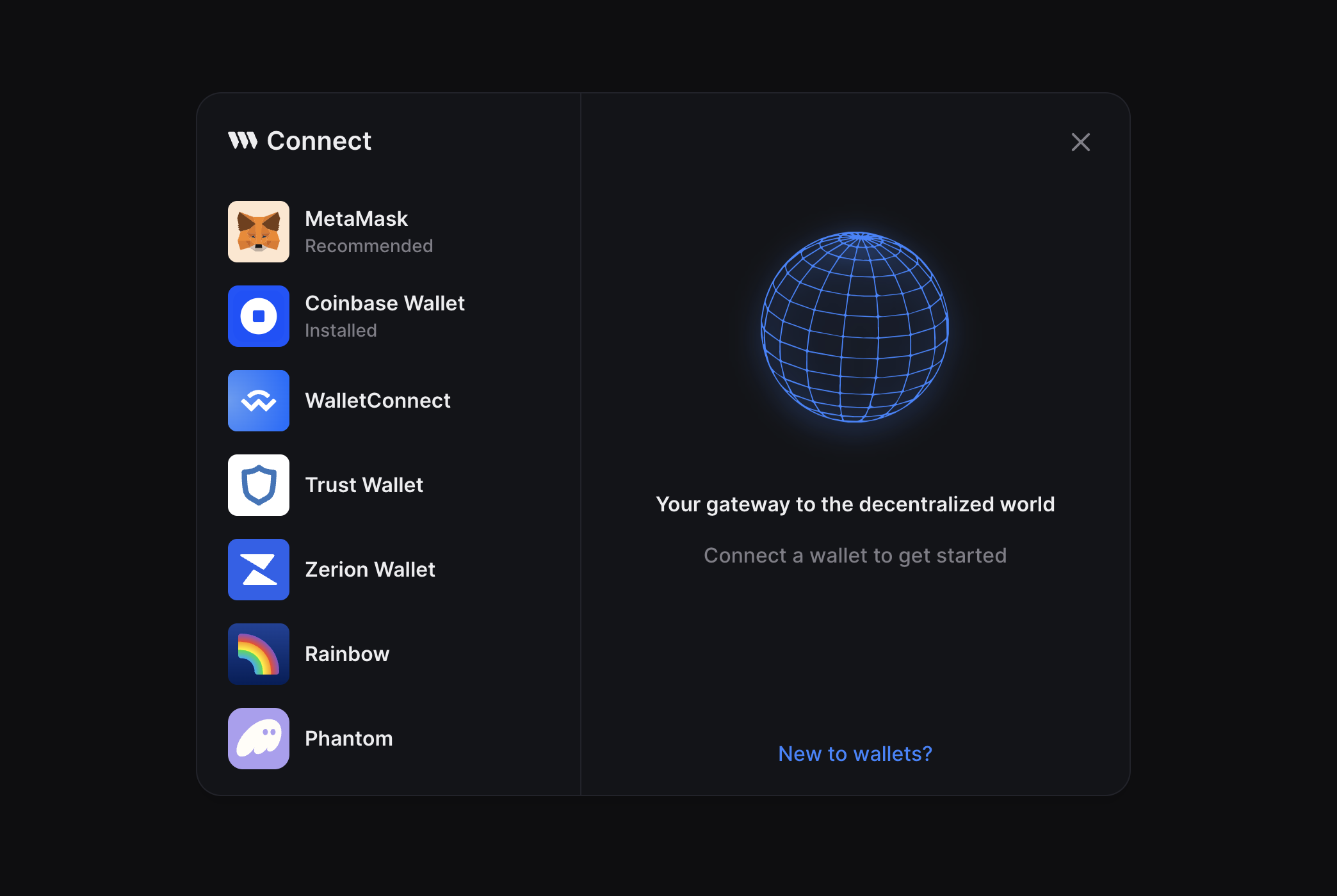
Compact
<ConnecWallet modalSize="compact" />
theme
Set the theme to either "light" or "dark" or pass a custom theme object to completely customize the look and feel of the ConnectWallet Modal.
The default is "dark"
<ConnectWallet theme="dark" />
Create a custom theme
Instead of passing an object along with all the required colors, you can use the darkTheme or lightTheme functions to use light / dark theme as base and override just the parts you want to change.
import { darkTheme, lightTheme } from "@thirdweb-dev/react";

const customDarkTheme = darkTheme({
  fontFamily: "Inter, sans-serif",
  colors: {
    modalBg: "#000000",
    accentText: "red",
    // ... etc
  },
});

<ConnectWallet theme={customDarkTheme} />;
btnTitle
Change the text on button when the ConnectWallet button is in the disconnected state.
The default is "Connect Wallet"
<ConnectWallet btnTitle="Login" />
welcomeScreen
This prop is only applicable when modalSize prop is set to "wide". On "wide" Modal size, a welcome screen is shown on the right side of the modal.
This screen can be customized in two ways
Customize Metadata and Image
<ConnectWallet
  welcomeScreen={{
    title: "Your Title",
    subtitle: "Your Subtitle",
    img: {
      src: "https://...",
      width: 300,
      height: 50,
    },
  }}
/>
Render Custom Component
<ConnectWallet
  welcomeScreen={() => {
    return <YourComponent />;
  }}
/>
modalTitle
Change the title of ConnectWallet Modal
The default is "Connect"
<ConnectWallet modalTitle="Login" />
detailsBtn
Render a custom button to display connected wallet details instead of the default one
<ConnectWallet
  detailsBtn={() => {
    return <button> .... </button>;
  }}
/>
className
This class is applied to the ConnectWallet button ( not the modal ). Using this className, you can further customize the button's styles using custom CSS.
For some CSS properties, you may need to use the
!important
to override the default styles
<ConnectWallet className="my-custom-class" />
dropdownPosition
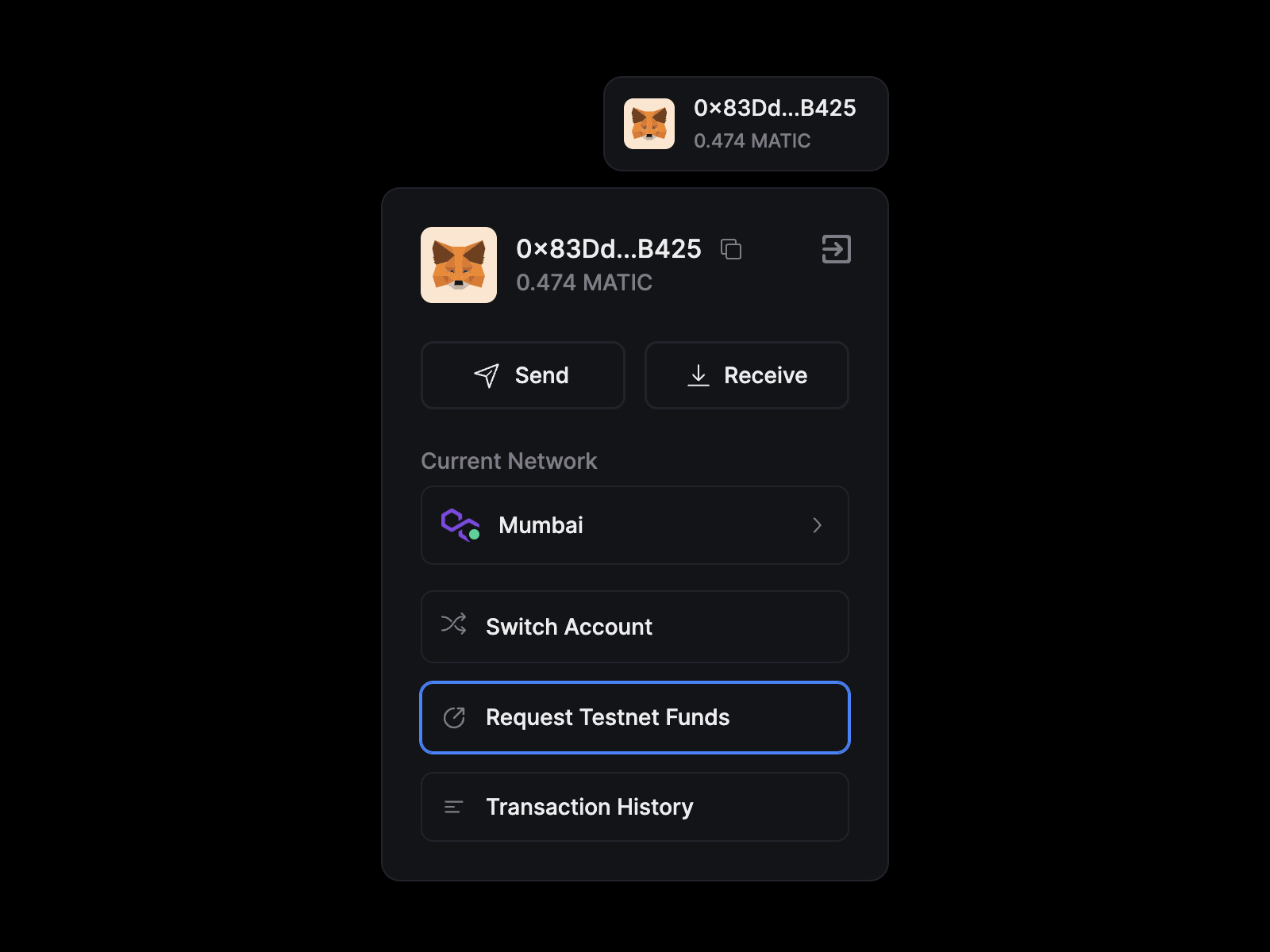
When user connects the wallet using ConnectWallet Modal, a "Details Button" is rendered. Clicking on this button opens a dropdown which opens in a certain direction relative to the Details button.
dropdownPosition prop allows you to customize the direction the dropdown should open relative to the Details button
<ConnectWallet
  dropdownPosition={{
    side: "bottom", //  "top" | "bottom" | "left" | "right";
    align: "end", // "start" | "center" | "end";
  }}
/>
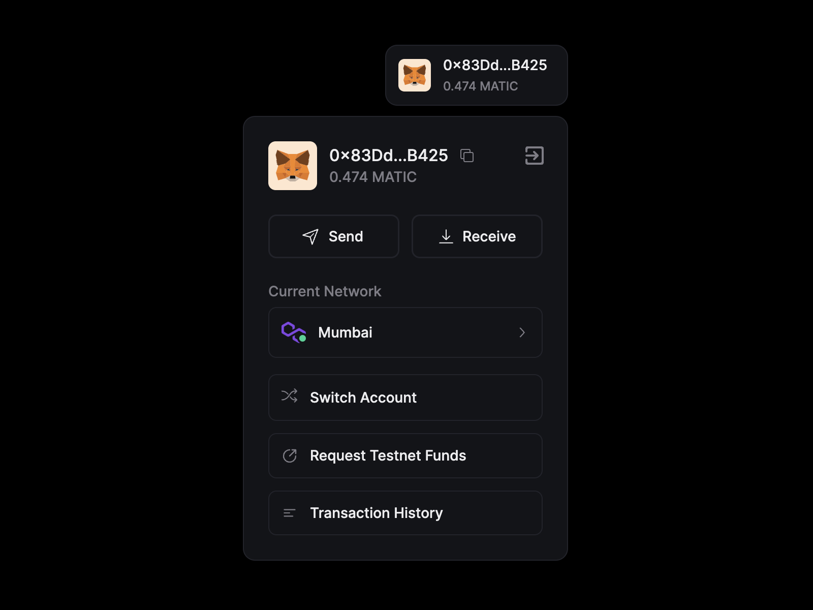
hideTestnetFaucet
Hide the "Request Testnet funds" link in ConnectWallet dropdown which is shown when user is connected to a testnet.
Default is false
<ConnectWallet hideTestnetFaucet={false} />
termsOfServiceUrl and privacyPolicyUrl
You can show a "Terms of Service" and/or "Privacy Policy" link in the ConnectWallet Modal by passing the termsOfServiceUrl and/or privacyPolicyUrl props
<ConnectWallet
  termsOfServiceUrl="https://...."
  privacyPolicyUrl="https://...."
/>
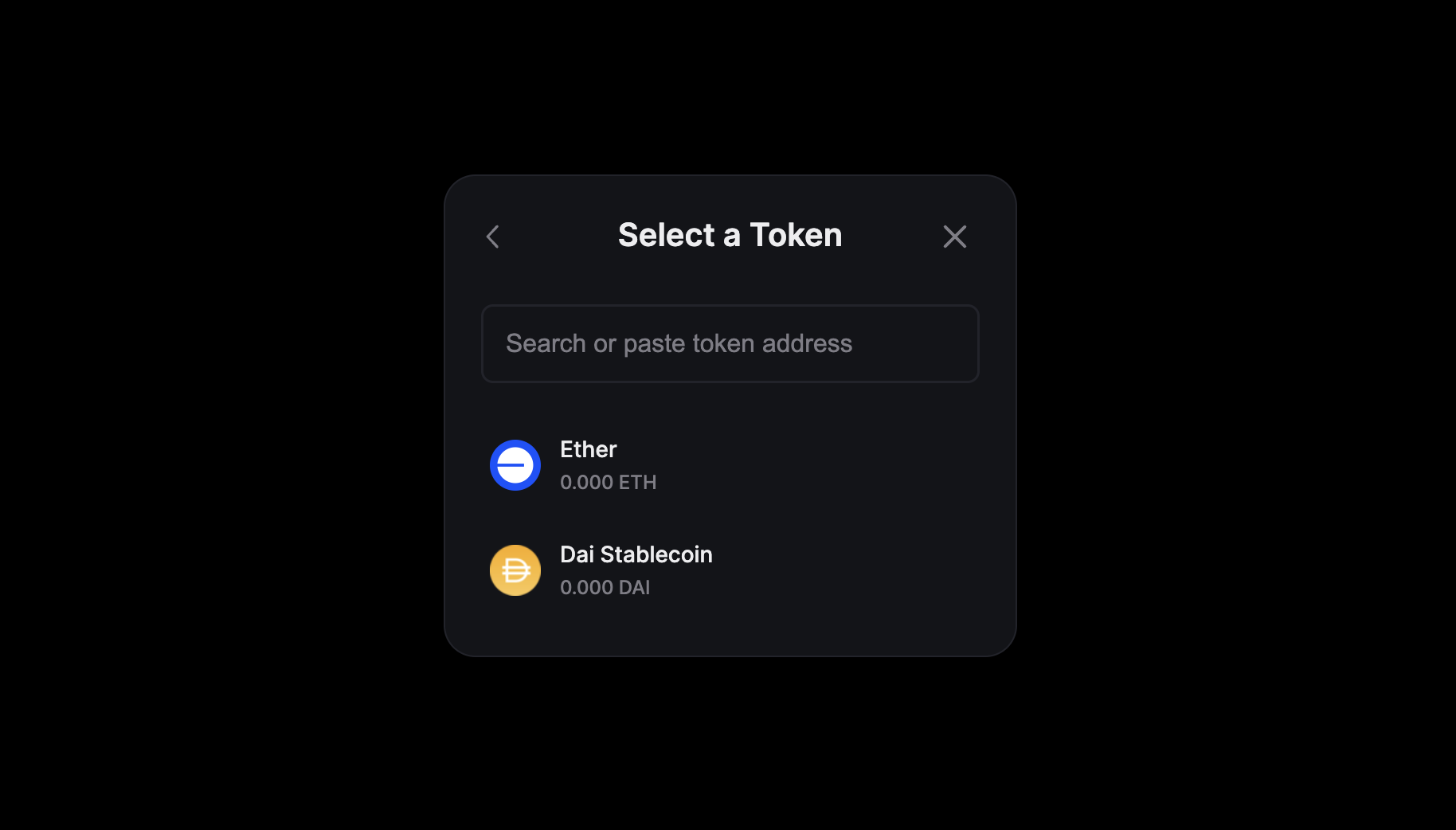
supportedTokens
Customize the tokens shown in the "Send Funds" screen for various networks.
By default, The "Send Funds" screen shows a few popular tokens for default chains and the native token. For other chains it only shows the native token.
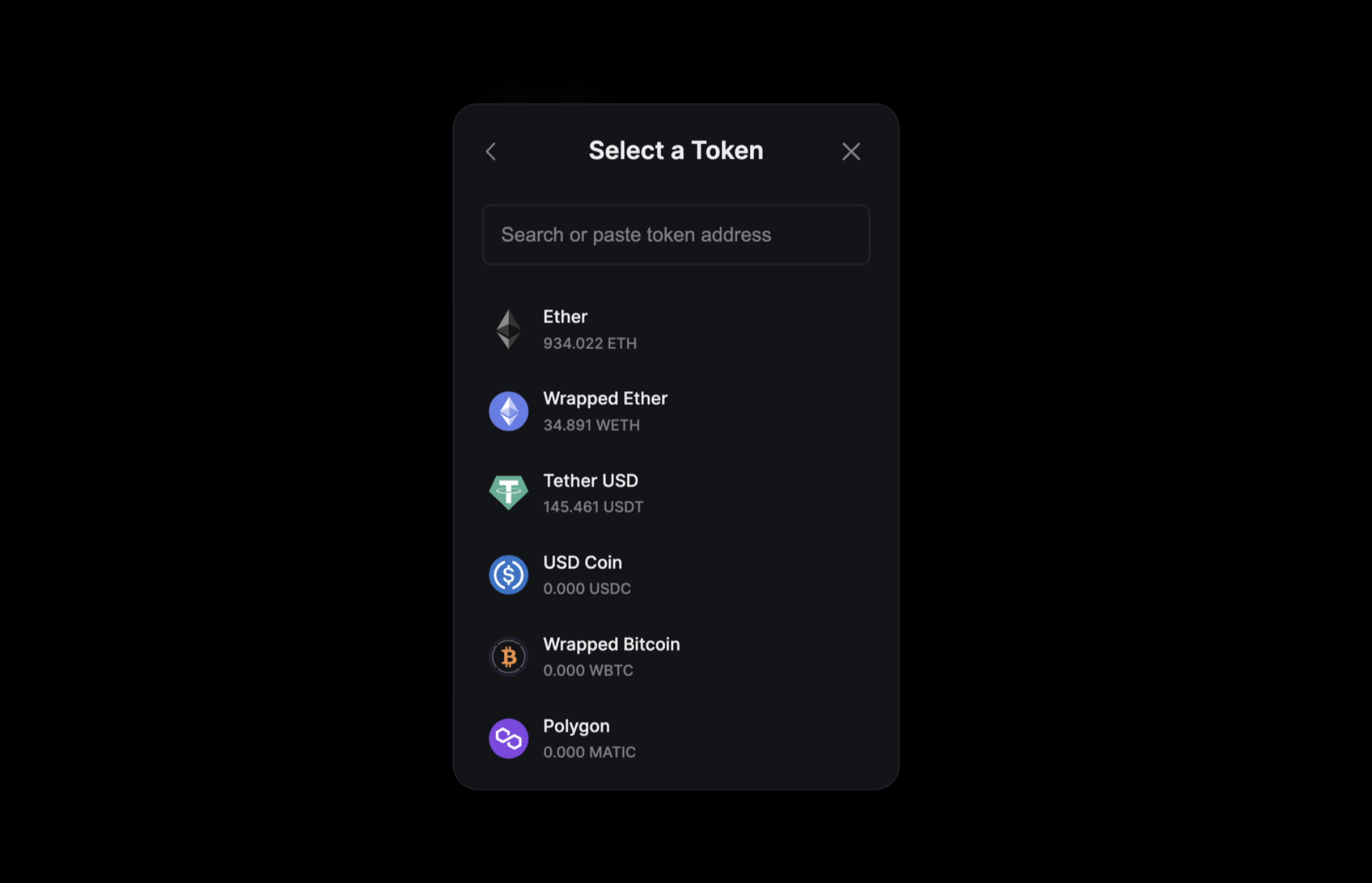
supportedTokens prop allows you to customize this list as shown below.
import { Base } from "@thirdweb-dev/chains";

// Show "Dai Stablecoin" when connected to the "Base" mainnet
<ConnectWallet
  supportedTokens={{
    // use chain id of the network as key and pass an array of tokens to show
    // you can directly pass the number or import the chain object from @thirdweb-dev/chains to get the chain id
    [Base.chainId]: [
      {
        address: "0x50c5725949A6F0c72E6C4a641F24049A917DB0Cb", // token contract address
        name: "Dai Stablecoin",
        symbol: "DAI",
        icon: "https://assets.coingecko.com/coins/images/9956/small/Badge_Dai.png?1687143508",
      },
    ],
  }}
/>;
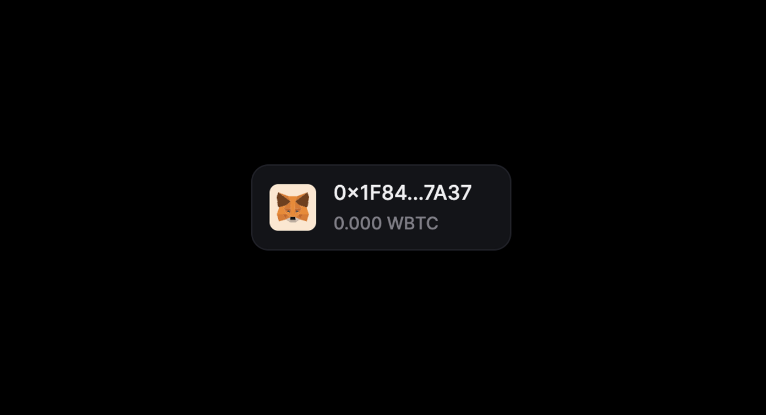
displayBalanceToken
Display the balance of a token instead of the native token in ConnectWallet details button.
import { Base } from "@thirdweb-dev/chains";

// show Wrapped BTC balance when connected to Ethereum mainnet
// Show Dai Stablecoin balance when connected to the Base mainnet

<ConnectWallet
  //  pass an object with chain id as key and token address as value
  displayBalanceToken={{
    // 1 is chain id of Ethereum mainnet
    1: "0x2260FAC5E5542a773Aa44fBCfeDf7C193bc2C599", // contract address of Wrapped BTC token

    // you can also import the chain object from @thirdweb-dev/chains to get the chain id
    [Base.chainId]: "0x50c5725949A6F0c72E6C4a641F24049A917DB0Cb", // contract address of Dai Stablecoin token
  }}
/>;
Functionality
auth
Enforce that users must sign in with their wallet using auth after connecting their wallet.
Requires the authConfig prop to be set on the ThirdWebProvider component.
<ConnectWallet
  auth={{
    loginOptional: false,
    onLogin(token) {
      console.log("user logged in", token);
    },
    onLogout() {
      console.log("user logged out");
    },
  }}
/>
switchToActiveChain
Specify whether to show a "Switch Network" button after the wallet is connected and it is not connected to the activeChain set in ThirdwebProvider to encourage the user to switch to the correct network in their wallet.
activeChain must be explicitly set in ThirdwebProvider for this to work.
default is false.
<ConnectWallet switchToActiveChain={true} />